PLAYNET: The Gaming Platform
Visual Design
Role: UI/UX Designer
Duration: 1 month
Softwares: Figma, Adobe Creative Suite
Platform: iOS


Product Overview
While digital gaming continues to grow in popularity, many people still enjoy in-person social games such as board games, card games, tabletop games, dice games, and battling tops. However, one common challenge for enthusiasts is finding enough players to join a game at the right time and place.
While digital gaming continues to grow in popularity, many people still enjoy in-person social games such as board games, card games, tabletop games, dice games, and battling tops. However, one common challenge for enthusiasts is finding enough players to join a game at the right time and place.
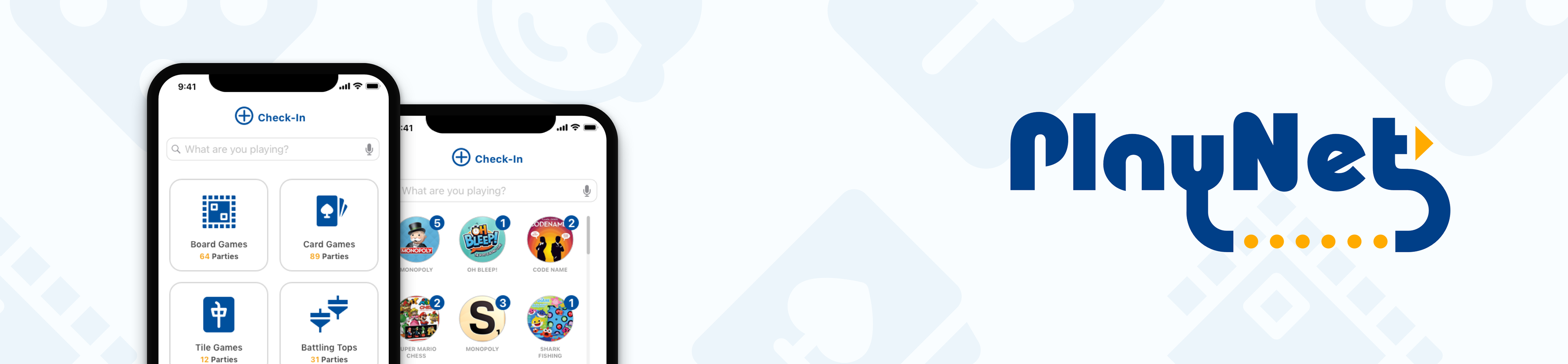
To address this problem, I designed Playnet, a platform that helps people discover, connect with, and organize in-person gaming sessions within their local communities. By matching players based on interests, availability, and location, Playnet makes it easier for users to find gaming companions, build friendships, and participate in the games they love.
The goal of Playnet is to reduce the friction of finding players and foster stronger social connections through shared gaming experiences.

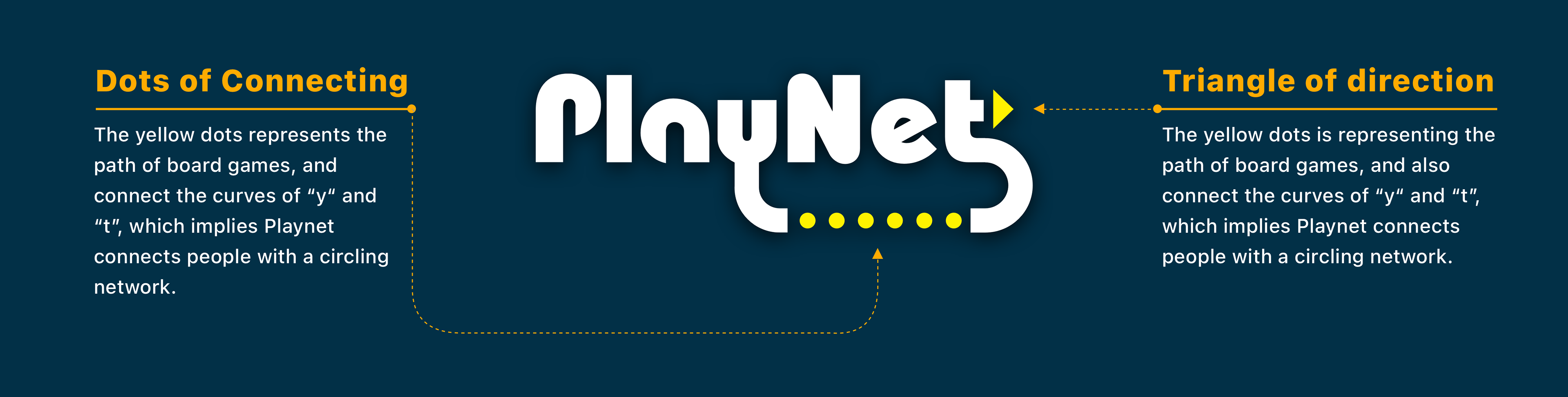
Logo

Improvement
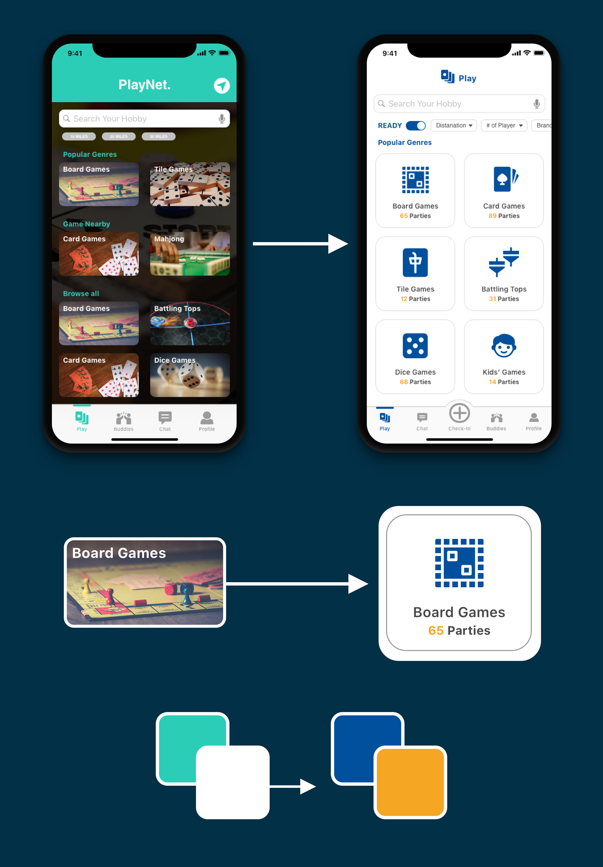
Refined Filtering Experience
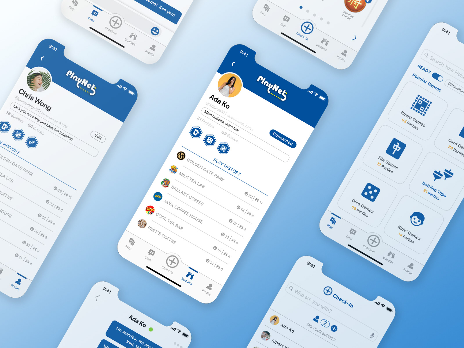
During the iteration process, I expanded the filtering system from a few basic distance-based tags into a more comprehensive set of filters. This enhancement allows users to narrow down search results more effectively based on their preferences, reducing the effort required to find relevant gaming groups.
To further improve efficiency, I introduced a new feature called the Ready Button. When activated, it displays only gaming sessions that are available to join immediately. This helps users quickly identify active opportunities without manually browsing through multiple listings, creating a faster and more convenient discovery experience.
Replacing Photos with Icons
The original design used photos to represent different game categories. Through visual exploration, I found that the variety of images created visual noise and reduced scannability. To address this, I replaced category photos with a consistent icon system.
The use of icons improved visual hierarchy, created a cleaner interface, and allowed users to recognize game categories more quickly while maintaining a cohesive design language throughout the product.
Improving Color Accessibility
The initial color palette relied on Tiffany Blue and White as the primary brand colors. However, further evaluation revealed accessibility concerns due to insufficient color contrast in certain interface elements.
To improve readability and ensure a more accessible user experience, I refined the color system and introduced a higher-contrast palette. The updated colors strengthened visual clarity, improved accessibility compliance, and enhanced the overall user experience across the platform.

Color System
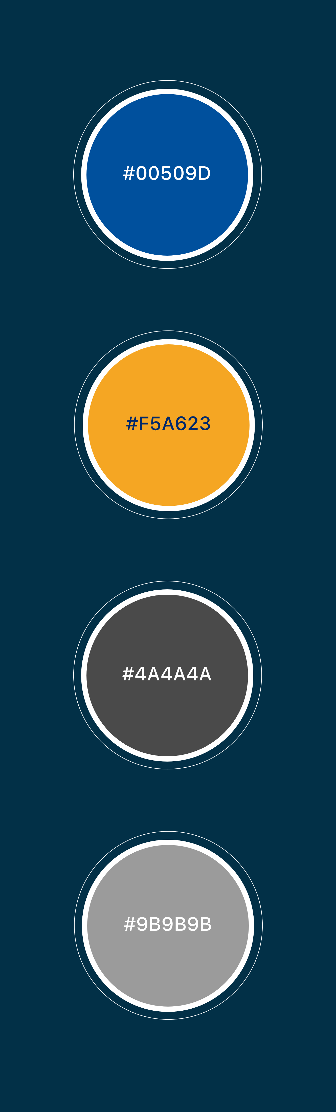
To establish a visual identity that reflects Playnet's mission of connecting people through shared gaming experiences, I developed a color palette that balances trust, energy, and usability.
Primary Color — Blue (#00509D)
Blue serves as the primary brand color for Playnet. As a platform designed to bring people together and foster new connections, the color was chosen to represent openness, trust, freedom, and exploration. These qualities align with Playnet's goal of creating an inclusive environment where users can discover new communities and expand their social networks.
Secondary Color — Orange (#F5A623)
Orange is used as an accent color to draw attention to important actions and interactive elements throughout the experience. Its vibrant and energetic nature creates visual contrast against the primary blue while helping guide users toward key actions such as joining a game session or engaging with the platform.
Neutral Color — Dark Grey (#4A4A4A)
Dark Grey is the primary text color used across the interface. It provides strong readability while maintaining a softer appearance than pure black, creating a clean and comfortable reading experience.
Neutral Color — Light Grey (#9B9B9B)
Light Grey is used for supporting interface elements such as dividers, borders, strokes, and secondary content. It helps establish visual hierarchy, separate content sections, and maintain consistency throughout the design system without competing for user attention.

Typography
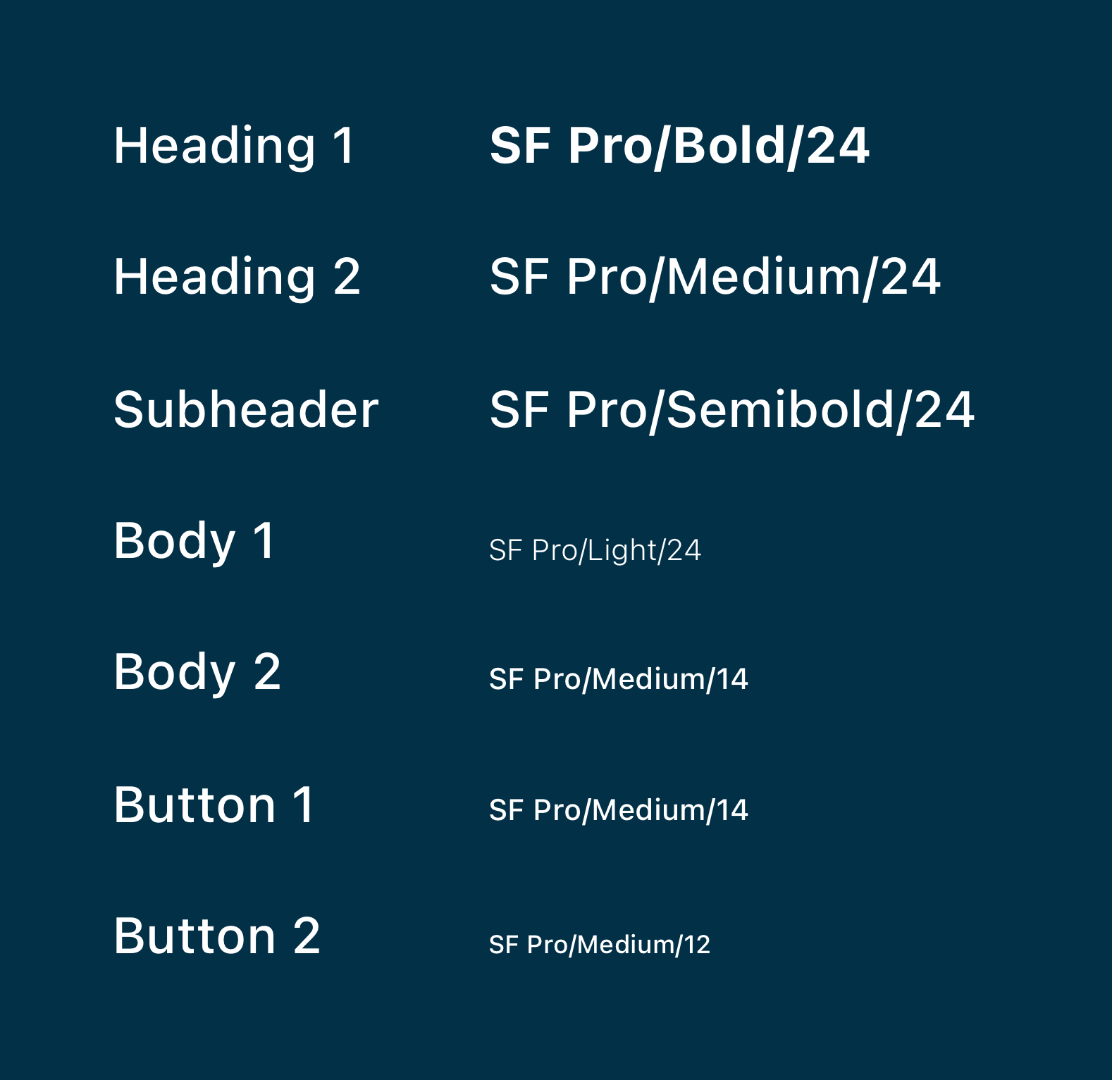
SF Pro was selected as the primary typeface due to its exceptional readability, flexibility, and optimization for digital interfaces. Its comprehensive range of weights and optical sizes enabled the creation of a clear visual hierarchy while maintaining consistency across the product. By using a single type family throughout the experience, the interface remains cohesive, accessible, and easy to navigate.

Iconography
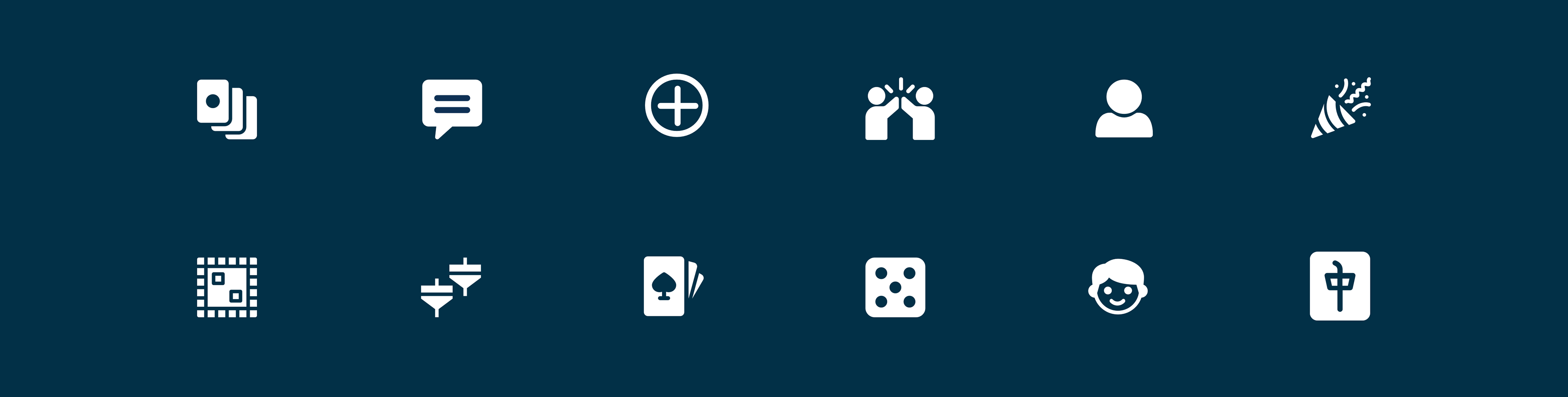
The PLAYNET icon system was designed to support quick recognition and effortless navigation across the platform. Drawing inspiration from familiar gaming and social interaction patterns, each icon represents a key feature or action while maintaining visual consistency throughout the experience.
A simple geometric style, uniform stroke weight, and rounded forms were used to create a cohesive and approachable visual language. The icons help reduce cognitive load by allowing users to identify content categories, platform functions, social interactions, and gameplay elements at a glance. By balancing clarity with a playful gaming aesthetic, the iconography strengthens the overall brand identity while enhancing usability and discoverability across the platform.

Design Kit
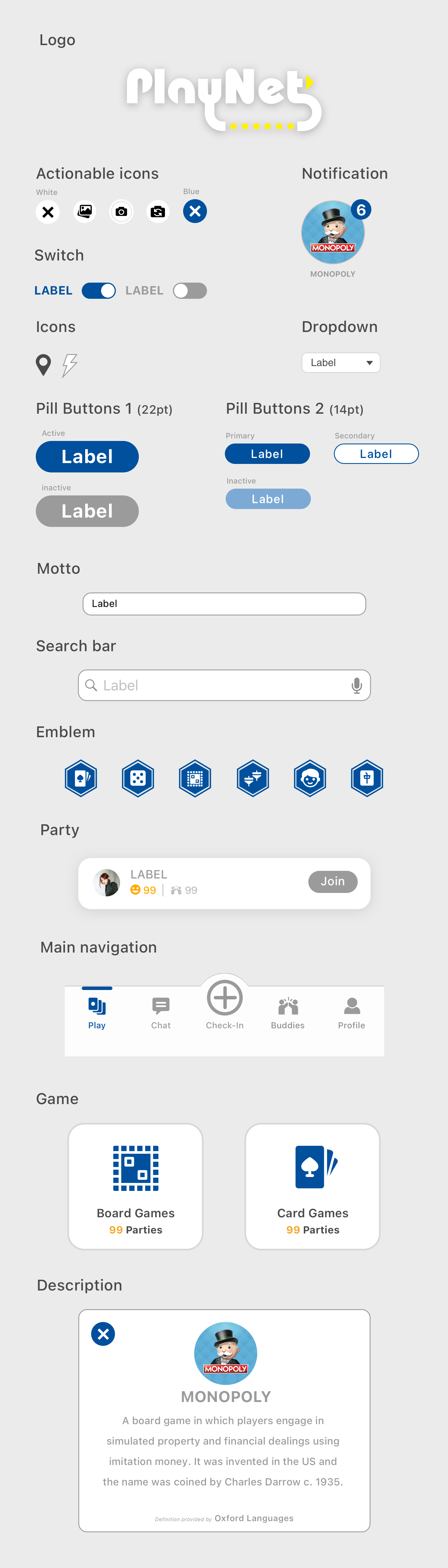
Thank you for exploring the visual design of PLAYNET. This project demonstrates how strategic visual design can enhance both user experience and product value. By establishing a bold and cohesive visual language, PLAYNET creates an engaging environment that improves content discoverability, streamlines navigation, and helps users quickly understand key actions and information.
Through thoughtful visual hierarchy, a consistent design system, and gaming-inspired aesthetics, the platform delivers a seamless and immersive experience while strengthening brand recognition. This work reflects my ability to leverage visual design as a strategic tool—not only to create compelling interfaces, but also to improve usability, increase engagement, and support broader product goals.