
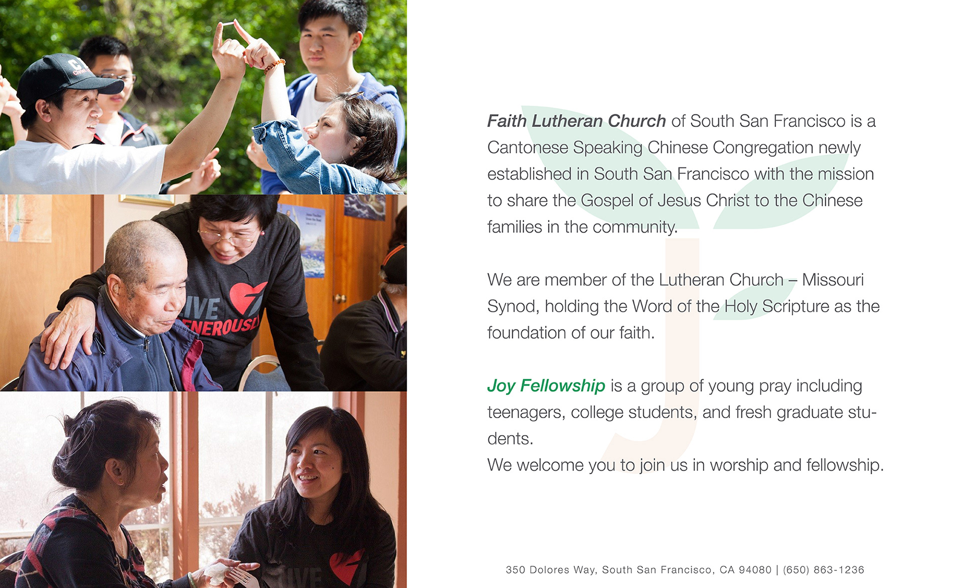

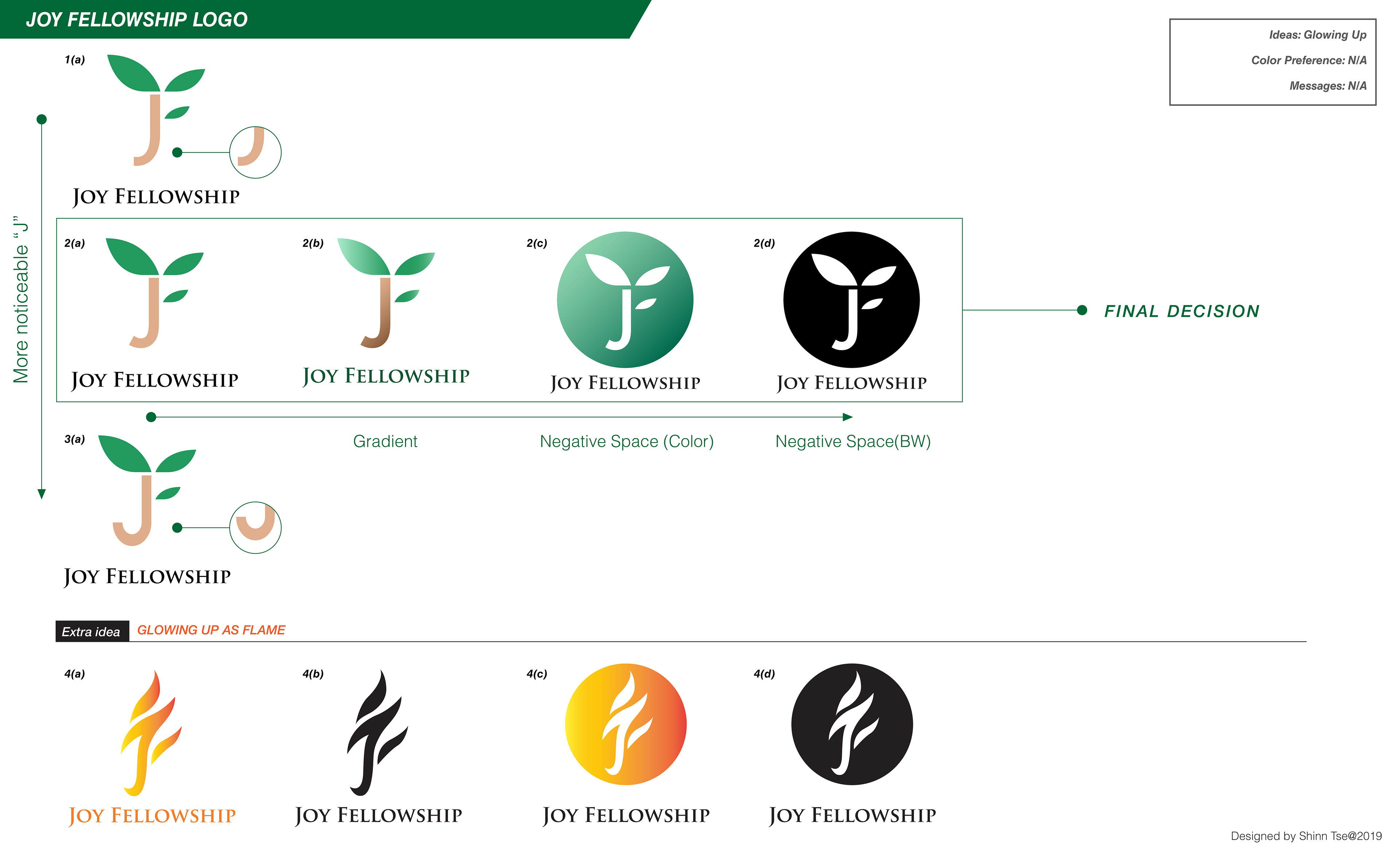
Joy Fellowship Logo Concept
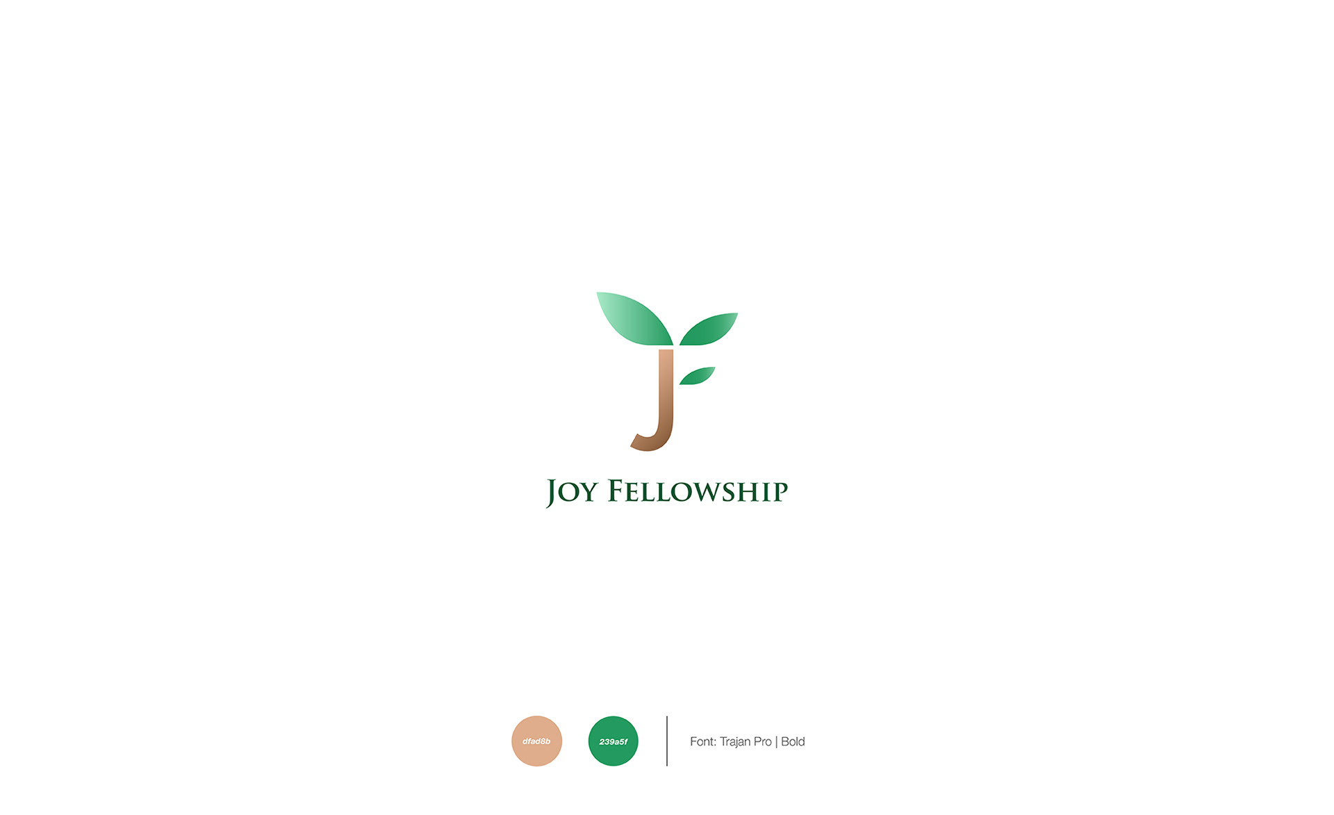
The Joy Fellowship logo combines a stylized “J” with growing leaves to symbolize growth, renewal, and community. The clean, organic design reflects the fellowship’s mission of nurturing faith and helping individuals flourish together.
Various versions were explored, including gradient, negative-space, and monochrome applications, to ensure versatility across print and digital media. The final design was chosen for its simplicity, strong recognition, and meaningful representation of joy, growth, and spiritual development.
Keywords: Growth • Faith • Community • Renewal • Hope • Simplicity.

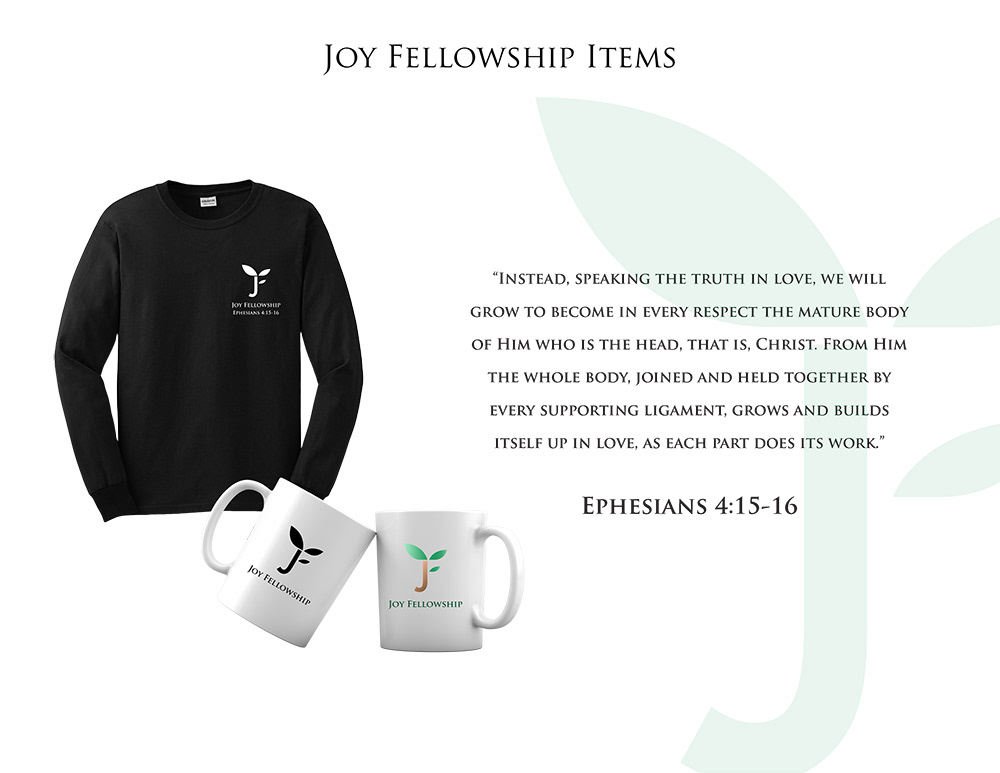
Joy Fellowship Branded Merchandise
The Joy Fellowship identity extends seamlessly across a range of branded merchandise, including apparel and drinkware. Featuring the signature leaf-inspired “J” logo, these items reinforce the fellowship’s message of growth, unity, and faith while creating a consistent and recognizable brand presence.
Inspired by Ephesians 4:15–16, the collection serves as a visual reminder of spiritual growth and community, helping members stay connected to the fellowship’s mission both inside and outside of gatherings.
Keywords: Community • Growth • Faith • Unity • Identity • Belonging.

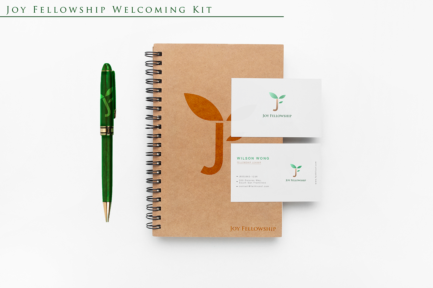
Joy Fellowship Welcoming Kit – Brand Identity Description
The Joy Fellowship Welcoming Kit presents a warm, professional, and nature-inspired brand identity designed to create a welcoming first impression for new members. The visual system combines earthy textures, clean typography, and fresh green accents to communicate growth, community, and spiritual renewal.
At the center of the design is a distinctive “J” logo integrated with two leaf elements, symbolizing life, flourishing, and fellowship. The logo is consistently applied across various branded materials, including a kraft-covered spiral notebook, business cards, and a custom green pen, reinforcing a cohesive and recognizable visual identity.
The color palette features:
Forest Green – representing growth, faith, and vitality.
Warm Earth Tones – conveying authenticity, humility, and approachability.
Soft White Backgrounds – creating clarity, elegance, and professionalism.
The use of a kraft paper notebook introduces a natural and sustainable aesthetic, while the clean business card layout communicates credibility and organizational excellence. The branded pen complements the identity with vibrant green tones and subtle logo integration.
Overall, the welcoming kit successfully balances modern simplicity, environmental warmth, and spiritual symbolism, making it an effective representation of Joy Fellowship’s mission to foster connection, growth, and a sense of belonging within its community.
Conclusion
The Joy Fellowship brand identity was developed to visually express the values of growth, faith, and community through a cohesive and meaningful design system. From logo development to branded merchandise and welcome materials, every element works together to create a recognizable and welcoming presence that reflects the fellowship’s mission. The final identity successfully balances simplicity, symbolism, and versatility, providing a strong foundation for Joy Fellowship’s communication and outreach efforts.
Thank you for taking the time to view this project. Your support and feedback are greatly appreciated!